
A Modern Digital
Front Door
A mobile-first, accessible rebuild of bvi.org.uk with an assistant that answers from your approved content — and a bespoke CRM & knowledge platform to replace Salesforce.
Executive summary
bvi.org.uk holds years of genuinely valuable information for the people the BVI London Office serves — visitors, residents, students, and investors. But the platform it sits on has aged out: navigation is split and confusing, the site was never designed for phones, there is no accessibility support, and every update depends on outside help. The result is a site that under-serves its audience and generates repetitive enquiries the team then has to absorb.
This proposal sets out a clean rebuild on a modern, well-structured WordPress foundation — keeping the content that works, reorganising it around the journeys people actually take, and adding the layer the meeting identified as the priority: intelligent guidance. A controlled AI assistant answers common questions from your approved content only and directs people to the correct department, form, or official site. Key forms become fillable on screen before download. An accessibility toolbar and WCAG 2.2 AA target make the site usable by everyone. And your team gains a clean editing experience so pages, forms, and information are updated in-house.
Track Two answers the second half of the meeting: replacing Salesforce. Today the office's contacts, student records, business cards, and working documents live in a system built for sales teams and licensed per seat, per year, forever. Track Two replaces it with a bespoke platform shaped to the office's actual work — stakeholders, students, outreach, workflows — powered by DocVault, our document-intelligence platform, so institutional knowledge becomes something the office can search and question, not just store. Online submissions, payments, and appointment booking remain on the roadmap and layer onto the same foundation when the office is ready.
Scope — Track One: full rebuild of bvi.org.uk (design, build, migration, AI assistant, forms, accessibility, training). Track Two: bespoke CRM & DocVault knowledge platform, replacing Salesforce.
Timeline — 12 weeks per part — around 20 weeks run as one combined programme.
Investment — $15,000 (website) + $8,000 (CRM & DocVault), each with 25% annual maintenance — broken down to the hour in section 20.
The Website
A clean rebuild of bvi.org.uk — organised around the people it serves, with guidance built in.
The situation
bvi.org.uk does its core job — it holds a lot of genuinely useful information. But it is carrying years of accumulated issues that make it hard to use and hard to maintain, and the people it serves increasingly arrive on a phone, where the site was never designed to live. Our review found six things that matter:
Dated theme & platform hygiene
An older custom WordPress theme, content and imagery dating to 2018, duplicated slider images, and placeholder text leaking into the site's metadata. What it means: the site reads as unmaintained, which undermines trust in an official government presence — and the theme itself is the ceiling on every improvement below.
Split, confusing navigation
Key services — Visas, Passports, Students, Residents — are divided across a primary and a secondary menu. What it means: the most important journeys are the hardest to find, and people who can't find the answer phone or email the office instead.
Not built for mobile
The viewport configuration is incomplete: a strong sign the site was never designed for phones. What it means: for a large share of your audience — students checking requirements, travellers mid-journey — the site is effectively broken at the moment they need it most.
No accessibility support
No contrast, text-size, or read-aloud tooling, and an older theme unlikely to meet current standards for contrast, keyboard use, or screen readers. What it means: some citizens cannot use the site at all — a real gap for a public office, and one modern standards (WCAG 2.2) are designed to close.
Dense pages & clumsy forms
The Visas page is one very long page around an unfilterable country table; student registration runs on an external Google Form; the visa form is a PDF emailed to a government address. What it means: the highest-traffic journeys carry the most friction, and data arrives in inboxes rather than anywhere structured.
Broken & stale elements
A malformed email link on the Visas page, a mix of insecure (http) and secure (https) links, and ageing widgets — a Twitter feed and a static currency line — that break or go stale. What it means: small failures, but visible ones, and the insecure links are flagged by modern browsers.
The information is valuable. The presentation, structure, mobile experience, and maintainability all need work — this is a clear candidate for a clean rebuild, not another patch on the existing theme.
What you told us
This proposal is scoped to the meeting — not to a wish list. The points below are the brief, and every line of scope in this document traces back to one of them.
- Refresh, don't discard — the new site reuses much of the existing content, with sections reworded and improved where needed.
- Information first, but smarter — the site stays information-based, while becoming easier to navigate and quicker to get answers from.
- Guide people to the right place — visitors should land at the correct department, form, or official external site, especially for visas, immigration, tourism, students, and residents.
- Own the answer when Google sends them to you — the office often ranks first when people search BVI matters, so it receives questions that belong elsewhere in the territory; the site should give basic, controlled guidance and route people onward correctly.
- Mobile-first and accessible — a modern, responsive experience with real readability and contrast options built in.
- Forms stay downloadable for now — with the option of making key forms fillable on screen before download; the completed visa form still goes direct to the Passport / Immigration Office, exactly as it does today.
- Check eligibility before the form — guided questions (residency years, spouse route, and so on) so people know whether they qualify before they spend time filling anything in.
- An assistant you control — any chat or AI feature answers from approved website content and internal guidance, never the open web, and directs people onward to the right department or official source.
- Let people maintain their own details — students, residents, and stakeholder groups update their own information, instead of the office chasing updates by email, record by record.
- Staff run the site — pages, forms, and information (including the visa country list) updated in-house, without outside help for every change.
The meeting also raised a more customised backend — a bespoke CRM to replace Salesforce, supporting stakeholder management, outreach, institutional knowledge, document management, and internal workflows. Rather than a separate document, that proposal is Track Two of this one (sections 14–18). Online submissions, payments, and appointment booking remain future options, on the roadmap in section 19.
Our approach
We recommend a clean rebuild on a modern, well-structured WordPress foundation — keeping the familiarity and easy editing of WordPress, on a fast, mobile-first, accessible theme built specifically for your content and audiences. Three principles shape everything below:
Organise around people, not the organisation
The current site reflects internal structure; the new one is organised around citizen needs. The homepage leads with the questions people actually arrive with — Do I need a visa? How do I register as a student? Who do I contact about residency? — and every journey ends at a clear action: the right form, the right department, or the right official site.
Answer first, then signpost
Most visitors want one answer, fast. Dense reference content (like the visa country list) becomes searchable and scannable, the assistant handles the common questions directly, and when the answer sits with another department or official body, the site says so plainly and links there — so people stop landing in the office's inbox by default.
Build for the next five years
Every choice — the theme, the forms, the admin backend, the assistant — is made so the roadmap in section 19 plugs in later without a rebuild: online submissions, payments, and booking all layer onto this foundation. And Track Two of this proposal applies the same thinking to the office itself, replacing Salesforce with a platform built around how you actually work.
The proposed structure
To be refined in discovery, the new information architecture centres on five audience journeys and one clear utility layer:
- Visiting the BVI — visas ('Do you need a visa?' checker), entry requirements, tourism signposting.
- Living & residency — residents' services, registration, official contacts.
- Studying — student registration, guidance, key dates and contacts.
- Doing business & investing — investor information and the right official channels; the office noted dedicated investor content is still being worked out, so this journey launches lean and grows when that content arrives.
- About the office — role, team, news, and how to reach the right person.
- Utility layer — search, the BVI Assistant, accessibility toolbar, and a single, well-organised forms library.
Early design concepts
Concepts prepared for this proposal, to illustrate direction — service cards organised around visitor needs, an ask/search hero, the accessibility toolbar, and the BVI Assistant.
Concept homepage — service cards organised around visitor needs, an ask/search hero, the accessibility toolbar, and the BVI Assistant. Illustrative only.
More page concepts
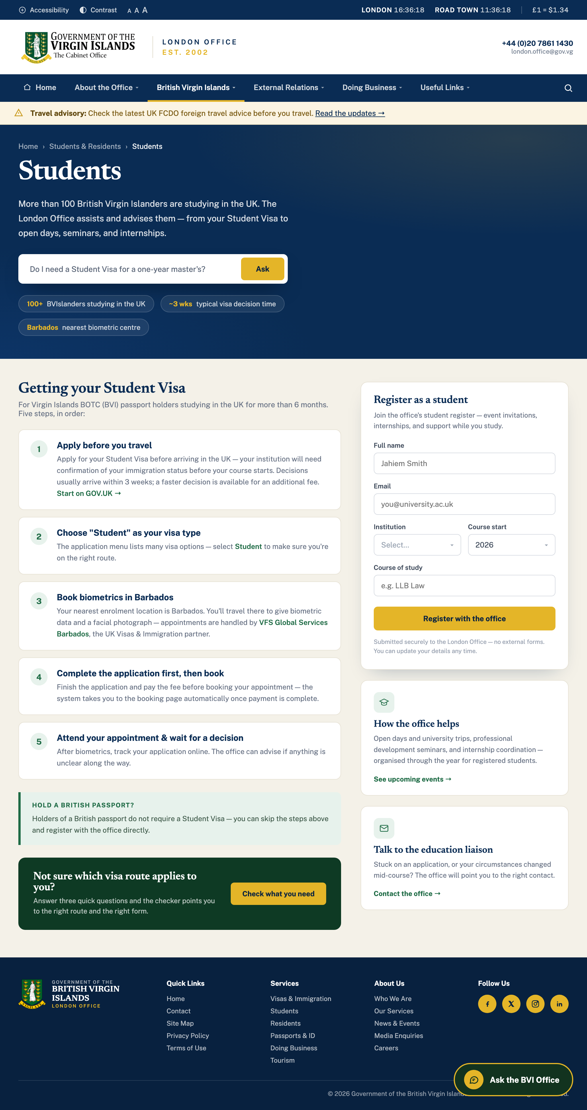
Further pages in the same design system, built from the real content on bvi.org.uk today — the Students journey restructured into clear steps, the Residents page with on-site registration and a single guides library, and Contact reframed around routing people to the right place.
concept-students.png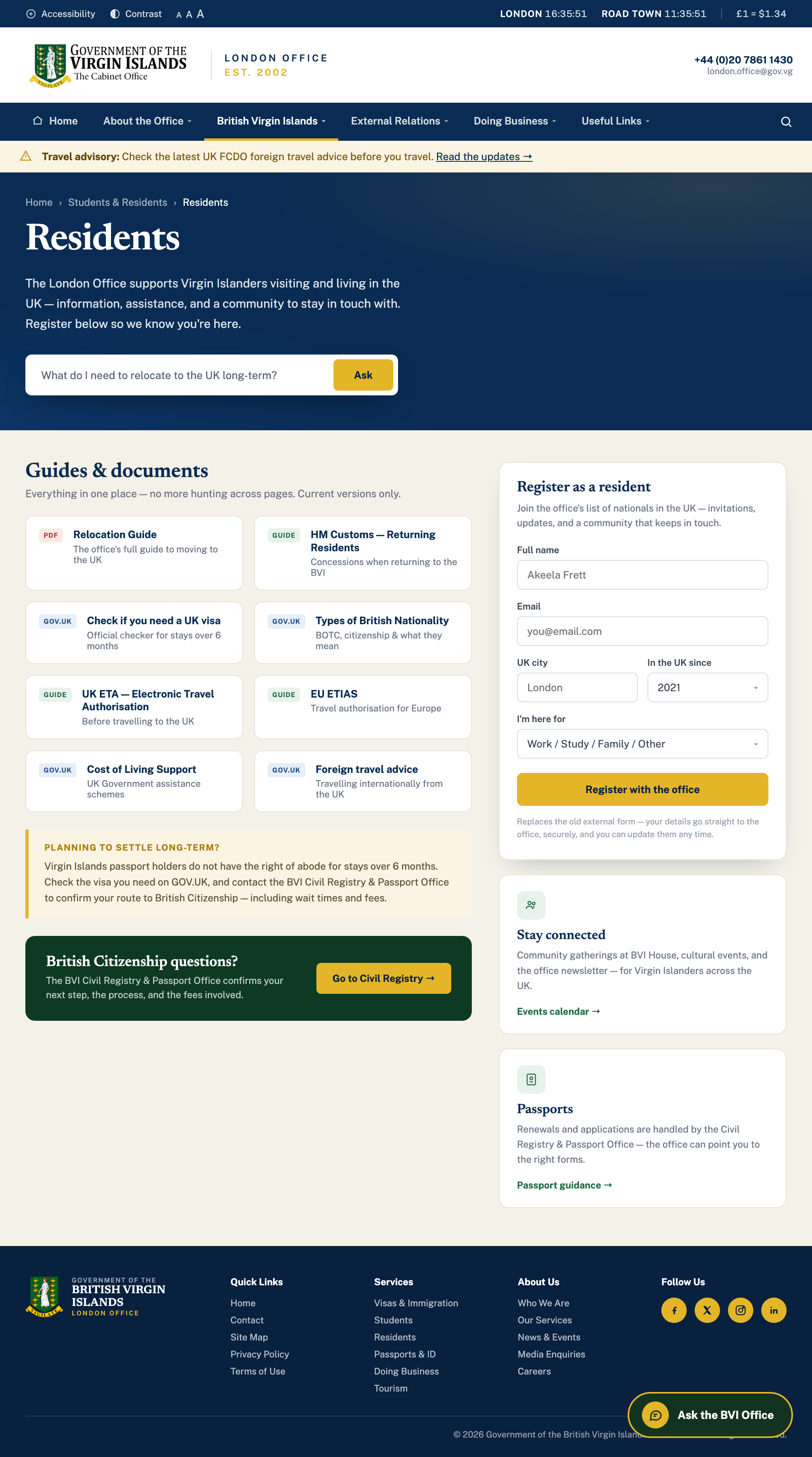
concept-residents.png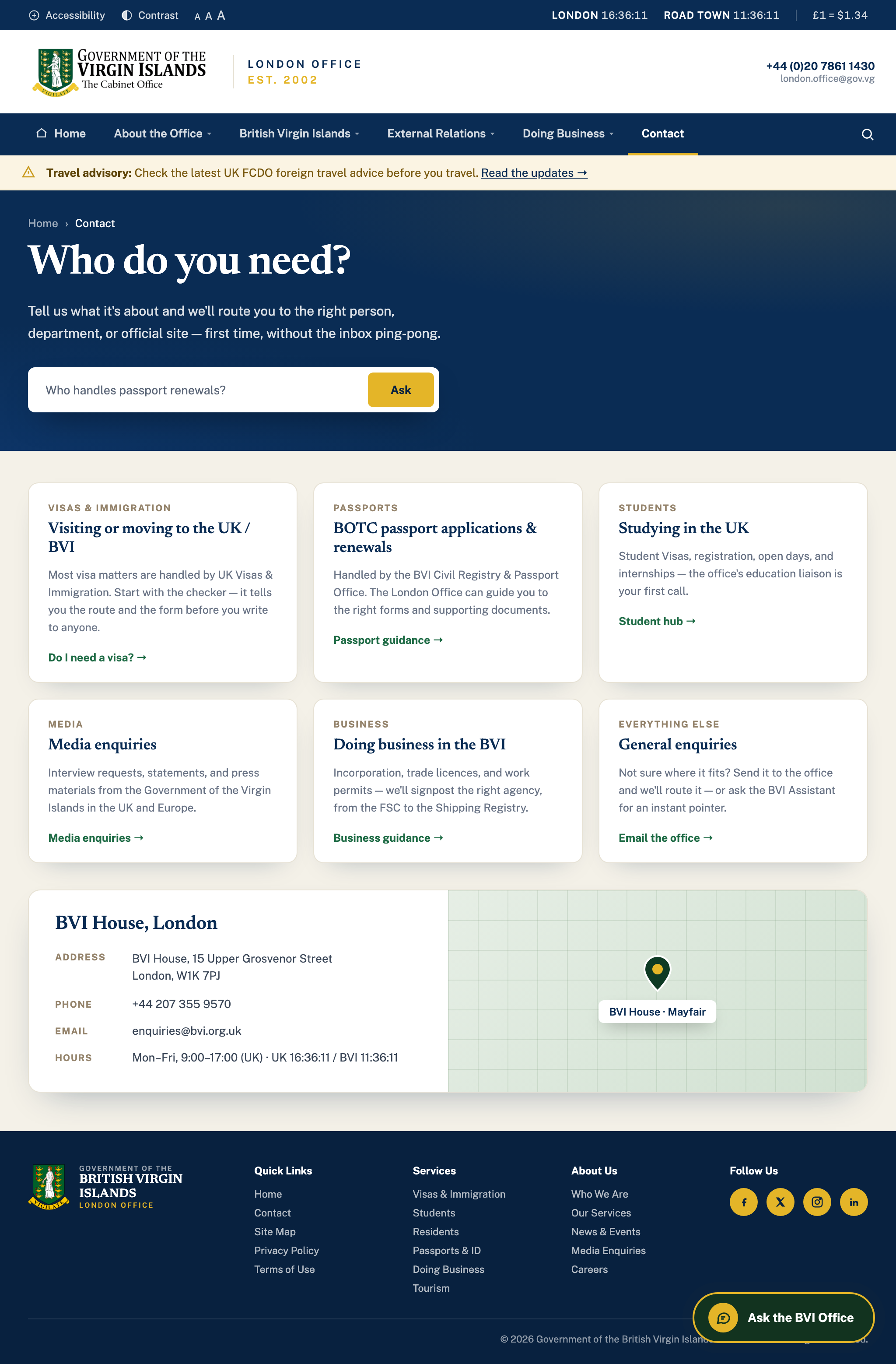
concept-contact.png
concept-mobile.pngWhat you get
A complete rebuild of bvi.org.uk — design, build, content, assistant, and training — delivered as one project. The four workstreams that carry the most weight each have their own section following this summary.
— A clean, modern rebuild
A fast, mobile-first WordPress foundation built for your content — keeping the familiar, easy editing of WordPress on a theme designed for how the site is actually used, organised around citizen needs rather than internal structure.
— Navigation that guides
One clear menu built around your key journeys — visas, immigration, tourism, students, residents. Every page signposts the correct department, form, or official site, so people end up in the right place the first time.
— The BVI Assistant
A chat assistant that answers from approved office content and internal guidance only — never the open web. Decision-tree questions handle common enquiries, and every answer points onward to the right department or official source. Detailed in section 06.
— Forms, made easier
Key PDFs made fillable on screen before download, drop-down forms in place of free-text where it helps, and a cleaner registration flow for students and residents — replacing the external Google Form. Detailed in section 08.
— Visas, untangled
The long country table becomes a searchable 'Do you need a visa?' checker, with the dense page restructured into clear, scannable steps — and the broken email link and http/https mix cleaned up along the way.
— Accessibility & readability
An accessibility toolbar with contrast and text-size options, targeting WCAG 2.2 AA — with keyboard navigation and screen-reader support considered from the first design. Detailed in section 07.
— A backend for your information
A simple, secure admin area to manage stakeholder, student, resident, and visitor information collected through the site — with registrants updating their own details, ending the record-by-record email chase. Synced into Salesforce from day one (section 09), and designed as the front porch of the bespoke CRM in Track Two (section 14).
— Yours to run
A clean WordPress editing experience with staff training and documentation, so your team updates pages, forms, and information — including the visa country list — in-house. No outside help for every change.
— Content migration
Every page inventoried and sorted — keep, reword, refresh, or retire — with priority pages rewritten, redirects preserved so nothing breaks, and stale widgets removed. Detailed in section 10.
— Performance, SEO & launch
Performance optimisation for fast page loads, a redirect strategy that preserves search rankings, clean metadata, cross-device QA, launch coordination, and a post-launch support window.
The BVI AssistantGuidance you control.
The single biggest lever for reducing repetitive enquiries is answering the common questions before they reach an inbox — and for this office the volume is structural: bvi.org.uk often ranks first when people search BVI matters, so questions that belong to departments in the territory land in London by default. The BVI Assistant is a chat feature on every page that absorbs exactly that — within boundaries the office sets.
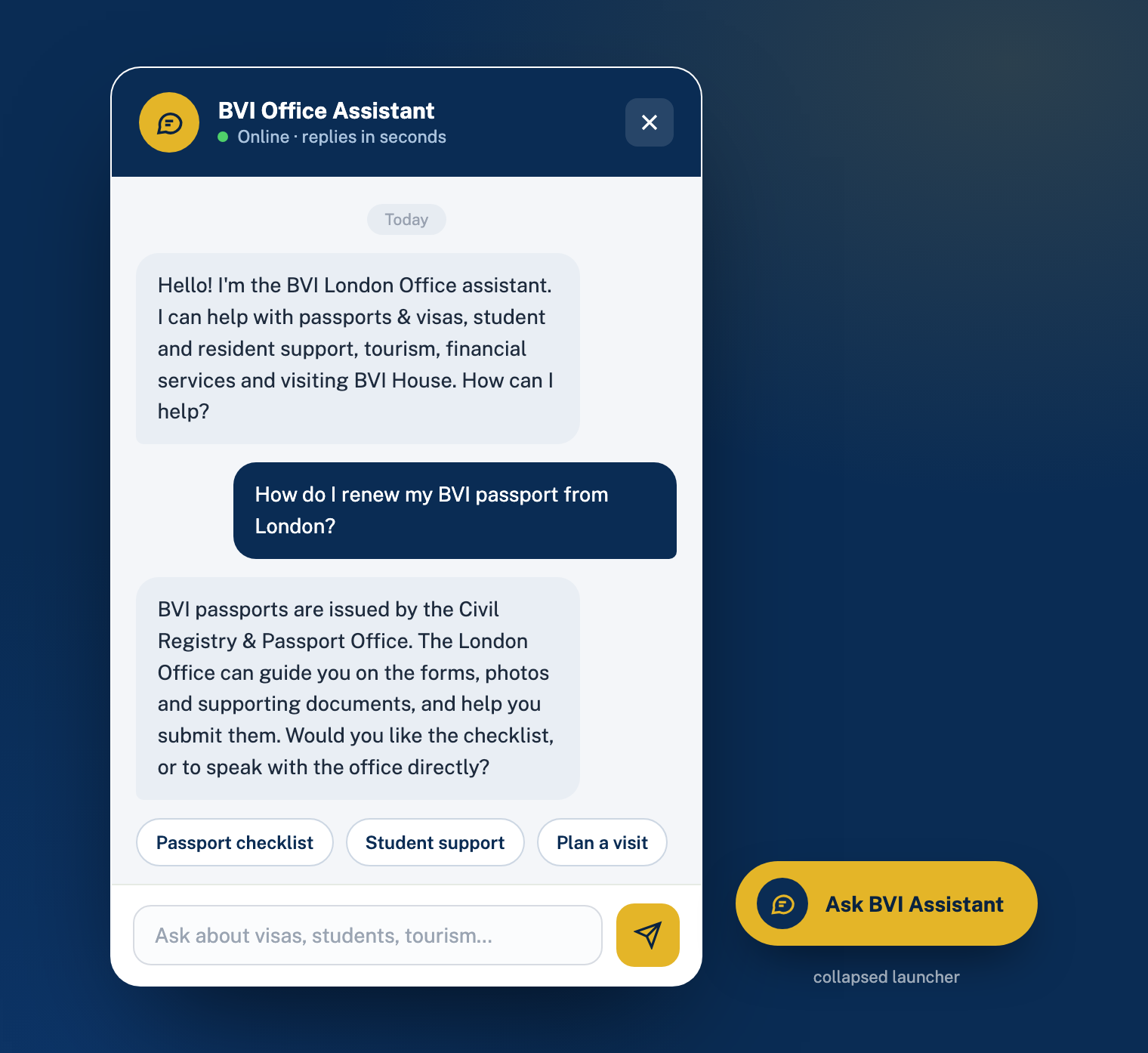
concept-assistant.pngConcept: the BVI Assistant — grounded in approved content, with quick-reply prompts and a clean handover to the right department. Illustrative only.
It answers only from your content
The assistant is grounded in a knowledge base built from approved website content and internal guidance supplied by the office. It does not search the open web, and it cannot introduce information from outside sources. If the answer isn't in the approved material, it says so — and points to the right contact instead of guessing.
Decision trees for the common journeys
For enquiries with a defined path, the assistant walks people through structured questions and lands them on a definitive answer with the correct next step. The visa checker is the clearest example — and eligibility pre-checks come first: before anyone downloads a passport form, guided questions (years of residency, spouse route, and so on) establish whether they qualify, so nobody spends an hour completing a form they were never eligible to submit.
It escalates, it doesn't improvise
Every answer ends somewhere useful: a page, a form, a department, or an official external source. For anything outside its knowledge base — legal interpretation, case-specific decisions, anything sensitive — it hands over cleanly with the right contact details rather than attempting an answer.
The office stays in charge of the knowledge
The knowledge base is reviewed with your team before launch, and updating it is part of the same editing workflow as the website: when a page or policy changes, the assistant's answers change with it. Nothing it says is outside content your team has approved.
No open-web answers. No speculation on case-specific or legal questions. No collection of sensitive personal data in chat. When in doubt, it directs the person to the correct department — which is precisely the behaviour a government office needs from an AI feature.
Accessibility, in practice
Accessibility for a public office is not a feature — it's an obligation, and one the current site doesn't meet. The rebuild targets WCAG 2.2 AA, the standard expected of UK public-sector websites, and treats it as a design constraint from day one rather than a checklist at the end.
— Accessibility toolbar
Visible on every page: text-size controls, high-contrast and readable-font modes, and read-aloud support — the readability and contrast options raised in the meeting, available to every visitor without asking.
— Designed accessible
Colour palettes checked for contrast before they're approved, focus states and touch targets sized properly, plain-language rewrites of priority pages, and meaningful headings and link text throughout.
— Keyboard & screen readers
The full site navigable by keyboard alone, semantic structure and alt text throughout, and forms properly labelled — tested with screen-reader software, not just assumed.
— Tested, not claimed
An accessibility audit against WCAG 2.2 AA before launch, documented results, and fixes applied — plus guidance for your team so new content keeps the standard after handover.
Forms & registration
Per the meeting, forms remain downloadable at this stage — the improvement is in how people find them, fill them, and how the office receives registrations. Three changes:
A single forms library
Every form in one organised, searchable place — clearly named, current version only, with a plain-language line on who each form is for and where it goes once completed. No more hunting through pages.
Fillable before download
Key PDFs — the visa application first among them — become fillable on screen: type the answers, then download or print a clean, completed copy. Drop-down selections replace free-text where it helps, which means fewer illegible or incomplete submissions. The completed form still goes exactly where it goes today — direct to the Passport / Immigration Office; the website just makes it far cleaner to complete, and the office collects nothing it shouldn't.
Registration that looks like yours
Student and resident registration moves off the external Google Form and onto the site itself — a clean, branded flow feeding the admin backend (section 05), so registrations arrive structured instead of scattered across inboxes. Built so that when the office is ready for full online submissions (section 19), the same flow simply switches over.
Salesforce & formsJoined up from day one.
The office runs on Salesforce today, and the meeting was clear: information entered on the website shouldn't sit in a separate pot — it should land where the office already works. So the website's forms are built API-connected from day one, and built so that the eventual move to Track Two is a switch, not a rebuild.
One form, structured data
Every on-site form — student registration, resident registration, stakeholder updates, enquiries — captures structured fields: drop-downs and validated inputs, not free text. What arrives is data ready to use, not prose for someone to re-type.
Straight into Salesforce, via the API
Each submission creates or updates the right Salesforce record through the Salesforce API — matched against existing contacts so no duplicates are created, mapped field-to-field with the office before launch, and logged on both sides. If Salesforce is ever unreachable, submissions queue and retry automatically; nothing is lost.
Self-service flows both ways
When a student, resident, or stakeholder updates their details through the site, the change lands on their Salesforce record within minutes — the manual, record-by-record database chase described in the meeting ends the day this goes live.
One switch at cutover
The public-facing forms never change. When Track Two goes live, the same integration layer redirects from Salesforce to the new platform — the migration happens behind the scenes, and the office's day-to-day carries straight over. Nothing built in Track One is thrown away.
At cutover: CRM & DocVault
One integration layer, two destinations — Salesforce from day one, the new platform at cutover. The forms never change.
Content migrationDone safely.
Eight to ten years of published content is an asset — and migrations are where that asset gets damaged. Here's how we protect it:
Inventory & triage
Every page, article, PDF, and image catalogued in discovery and sorted with your team into four piles: keep as-is, reword, refresh, or retire. Nothing is migrated by accident, and nothing valuable is lost by accident either.
Priority pages rewritten
The pages that carry the most traffic and the most confusion — Visas first — are rewritten in plain language, restructured for scanning, and rebuilt around clear next steps. The About / office pages, which the meeting flagged as outdated, are refreshed in the same pass. The remainder migrates cleanly onto the new templates.
Redirects preserve everything
Every old URL maps to its new home. Bookmarks, links from other government sites, and search-engine rankings all carry over — no dead ends, no lost visibility. Insecure http links are corrected to https across the site as part of the same pass.
Parallel review before launch
The full new site is staged privately for your team to review against the current one — every priority page checked, every form tested, every redirect verified — before anything goes live. The old site remains untouched until cutover.
Hosting, security & reliability
A government office's website has to be dependable and demonstrably secure. Whichever engagement option you choose in section 20, the platform is set up to the same standard:
— HTTPS everywhere
SSL across the entire site, the http/https mix eliminated, and security headers configured — no browser warnings on an official government site.
— Daily off-site backups
The site and its data backed up daily to a separate location, restorable in minutes — so a hardware failure or bad update is an inconvenience, not a crisis.
— Hardened WordPress
A minimal, vetted plugin set, strong authentication for the admin area, role-based access for staff, and software updates applied on a schedule — closing the most common attack paths on WordPress sites.
— Monitored & maintained
Uptime monitoring with alerts, a monthly security review, and update management — handled by us under the managed option, or documented and handed over cleanly under full ownership.
Scale of the migration
The approximate size of the current site, to be validated in discovery. All existing content is assumed migrated unless we agree otherwise.
| Content type | Estimated |
|---|---|
| Core pages | 20–30 pages |
| Historical news articles | 300–600 articles |
| PDF documents | 40–80 files |
| Images & media | 500+ files |
| Online / downloadable forms | 2+ forms |
| External services & portals | 6+ links |
| Years of published content | 8–10 years |
Track One timelineTwelve weeks from kickoff to launch, week by week.
Phased so you review and approve at every stage. Nothing proceeds to build until the design is signed off; nothing goes live until your team has walked the staged site.
Discovery & architecture
Kickoff with the office; goals, audiences, and priority journeys confirmed; full content inventory (keep / reword / refresh / retire); sitemap and information architecture agreed.
Design
Design direction concept presented for approval, then mobile-first layouts for the homepage, service pages, forms library, and news — reviewed with your team before build begins.
Core build
Theme development on the approved designs; templates, navigation, search, and the accessibility toolbar built and working on a private staging site.
Content migration
All retained content migrated onto the new templates; priority pages rewritten; redirects mapped; the visa checker replaces the country table.
The BVI Assistant
Knowledge base assembled from approved content and internal guidance; decision trees built for the priority journeys; assistant reviewed with your team and its boundaries confirmed.
Forms & backend
Forms library assembled, key PDFs made fillable, student and resident registration built on-site, and the admin backend connected.
Accessibility & performance
WCAG 2.2 AA audit and fixes; screen-reader and keyboard testing; performance optimisation and cross-device QA.
Review & training
Your team walks the full staged site; feedback applied; staff training delivered with documentation handed over.
Launch
Final checks, DNS cutover, redirects live, and monitoring on — followed by a 30-day post-launch support window at no charge.
Content decisions and feedback turnaround. With timely reviews from the office, twelve weeks holds; slower cycles stretch it, and we'll flag that early rather than late.
CRM & DocVault
A bespoke CRM & knowledge platform — replacing Salesforce with a system built around how the office actually works, and turning years of documents into institutional memory you can ask questions of.
The case for leaving Salesforce
The office's working life runs through Salesforce today: contact management, student records, business cards captured into the system, information stored against people and organisations — plus stakeholder groups the office engages across different areas, kept current by a staff member manually chasing updates, record by record. It works — the way the old website works. It holds the information. But it was never designed for this job, and the mismatch costs the office in four ways:
Built for sales pipelines, not a government office
Salesforce is organised around selling — pipelines, opportunities, quotas. The office's actual work — stakeholders, students, outreach, official records — has to be bent to fit categories designed for a sales team, which is why so much of it ends up in generic fields and workarounds.
Licensed per seat, per year, forever
Every user is a recurring licence that renews annually and never converts into anything the office owns. The costs continue indefinitely — and rise with every person added.
Paying for what you don't use, missing what you do
Most of Salesforce's surface area goes untouched, while the things the office actually needs — document management, institutional knowledge, workflows shaped to how you operate — either aren't there or live scattered across inboxes and shared folders instead.
Knowledge that walks out the door
What the office knows — who was contacted about what, where the agreement is, how a process works — lives partly in the system and partly in individual inboxes and memories. When people move on, that knowledge goes with them.
One platform, owned outright: stakeholders, students, outreach, workflows, and a searchable knowledge vault — no per-seat licences, hosted securely, and integrated with the new website so registrations and enquiries flow straight in.
The platformWhat it does.
A bespoke system shaped to the office's actual work — every module below replaces something currently done in Salesforce, an inbox, or someone's memory.
— Contacts & organisations
One clean record per person and organisation — officials, institutions, partners, media, and the engagement groups the office works with. Photograph a business card and the contact is created from it. Tag by type, log every interaction — and registrants keep their own details current through the website, ending the manual database upkeep.
— Student management
A full student registry with status, history, notes, and documents per student — and registrations from the new website (Track One) flowing straight in as structured records, not emails to be re-typed.
— Outreach & communications
Segmented lists built from your tags — invite every student to an event, or every investor to a briefing — with newsletters and invitations sent from the platform and automatically logged to each contact. You always know who was reached, and when.
— Workflows & tasks
Follow-ups, assignments, approvals, and reminders — the manual chasing replaced by a system that remembers. A registration arrives, a task is created; a follow-up is due, the right person is nudged.
— Documents & knowledge — DocVault
The office's documents become a secure, searchable knowledge vault you can ask questions of in plain language, with cited answers. This is the heart of the platform — detailed in section 16.
— Website integration
Track One and Track Two are one ecosystem: the same integration layer that feeds Salesforce from day one (section 09) redirects here at cutover — enquiries, registrations, and self-service updates land against the right record, and nothing built in Track One is thrown away.
— Reporting
Stakeholders by type and activity, outreach performance, student numbers, workload — the office's operational picture on one screen, instead of assembled by hand when someone asks.
— Security & governance
Role-based access (who can view, edit, export), a full audit log of every action, daily off-site backups, and data that belongs to the office — held securely, never used to train public AI models.
DocVaultYour institutional memory.
DocVault is our document-intelligence platform — built by Evoluut and already in service (whosaidwhat.ai/services/docvault). Inside the CRM, it becomes the office's institutional memory: every agreement, policy, report, and record in one secure place that answers questions instead of just storing files.
Upload & organise
PDFs, Word documents, spreadsheets, and more — organised in folders, tags, and collections by department or topic, with fast search across everything. The office's existing document archive is loaded and structured as part of the build.
Ask in plain language
No keywords, no digging through folders: 'What did we agree with the university in 2023?' — 'What's our procedure for X?' — 'Summarise the correspondence on this matter.' DocVault understands the question and searches across the whole vault.
Get answers with citations
Every answer links to the exact source passage, so it can be verified in one click — trust-first by design, with a mode that only shows answers backed by a source. From there, generate summaries, briefs, and meeting packs in minutes.
Built for an office like yours
- Institutional knowledge that stays — what the office knows no longer depends on who is in the room; new staff ask the vault and get guided, cited answers from day one.
- Precedent on demand — the office's cross-territory work becomes answerable: how a situation was handled before, what other overseas territories did, what was agreed and when — asked in plain language, answered with the source.
- Paper included — records that exist only on paper are scanned in batches and loaded into the vault, so the office's history becomes searchable too — the digitisation exercise discussed previously, finally with a home to land in.
- Meeting prep in minutes — summarise a briefing pack, pull key decisions, and generate talking points before a meeting instead of after a search.
- Governance built in — role-based permissions on viewing, chatting, and exporting; an audit log of every document access and query; and redaction tools to mask sensitive data before a document is indexed. The meeting named security as the deciding concern for any system holding the office's information — this is designed to pass that test, and we'll walk through the security model with you before a single document is loaded.
- Private by design — the office's documents are never used to train public AI models, and the platform can be deployed to meet the office's data-control requirements.
DocVault is an existing Evoluut platform, not a from-scratch experiment — the office gets a proven product, configured to its documents, its departments, and its permissions, inside a CRM built around its work.
Leaving Salesforce, safely
The value in Salesforce is the data, not the software — and the migration is designed around protecting it:
Export & audit everything
A complete export of the office's Salesforce data — contacts, organisations, student records, notes, activity history, and attached documents — audited with your team so we know exactly what exists before anything moves.
Clean & map
Duplicates merged, stale records flagged for a decision, and every field mapped to its home in the new platform. Documents route into DocVault; people and organisations into the registries. Nothing is imported blind.
Parallel period
Both systems run side by side while your team works in the new platform and verifies the records that matter — with balances of information checked against Salesforce until you're satisfied every record made the crossing.
Cutover & retire
Salesforce goes read-only, then — when the office is ready — the licences are cancelled. From that day, the recurring per-seat cost ends, permanently.
Track Two timelineTwelve weeks from kickoff to cutover.
Run in sequence after the website, or overlapped from week 9 of Track One — bringing the whole programme to roughly 20 weeks.
Discovery & data audit
How the office actually uses Salesforce today, mapped process by process; full data export and audit; the data model for the new platform agreed.
Design
Screens and workflows designed around the office's real tasks — reviewed with the team who will use them daily, before anything is built.
Core build
Contacts & organisations, business-card capture, the student registry, and outreach — built and working on a private staging environment.
DocVault configuration
The vault configured for the office's departments and permissions; the existing document archive loaded, organised, and indexed.
Workflows & website integration
Tasks, reminders, and approvals built; the Track One website connected so registrations and enquiries flow into the platform automatically.
Salesforce migration
Cleaned, mapped data imported and reconciled — every contact, student record, and document accounted for against the audit from week 1.
Parallel period & training
Both systems side by side; your team works in the new platform, verifies records, and is trained with documentation handed over.
Cutover
Salesforce goes read-only; the platform takes over; 30-day post-cutover support window at no charge — and the per-seat licences are yours to cancel.
Roadmap, investment & next steps
What layers on later, what it costs today, and how we begin.
Looking ahead — the roadmap
Both parts are designed so the future you described plugs in without a rebuild. When the office is ready, each of these switches on top of the same foundation:
- Online submissions — forms submitted directly through the site rather than downloaded and emailed, landing in the Track Two platform as structured records. The fillable forms and registration flows in this build are the first half of that work.
- Payments & document services — secure online payment of fees, and notarised / authorised document services requested and paid for online once the office's approvals are in place — targeted for late 2026 / early 2027, per the meeting.
- Appointment booking — the weekly visa-consultation slots discussed in the meeting, bookable online, confirmed automatically, and logged against the visitor's contact record.
- Deeper intelligence — as the vault and the registries grow, so does what the office can ask of them: outreach informed by real engagement history, and reporting that spans the website, the CRM, and the document archive.
The bespoke backend / CRM raised in the meeting is not a future item — it is Track Two of this document (sections 14–18), including the replacement of Salesforce and the DocVault knowledge platform.
Investment
Two platforms, priced and maintained separately — take both, or either on its own. Every workstream is broken down to the hours behind it, at a blended rate of roughly $60/hour. The figures are fixed against the scope in this document; the hours show you where the effort goes. If discovery changes the scope, the figure changes with it — agreed in writing before build begins, never after.
one-time + 25% annual maintenance
+ $3,750/yr
one-time + 25% annual maintenance
+ $2,000/yr
everything in this document — no per-seat licences, ever
+ $5,750/yr
Track One — the website · $15,000
Roughly 250 hours of work, broken down:
| Workstream | Covers | Hrs | Amount |
|---|---|---|---|
| Discovery & architecture | Kickoff, content inventory, sitemap & IA | 20 | $1,200 |
| UX/UI design | Design direction plus mobile-first layouts for all key templates | 36 | $2,150 |
| Build & development | Theme, templates, navigation, search & accessibility toolbar | 62 | $3,700 |
| Content migration | Full migration, priority-page rewrites, redirects, link cleanup | 30 | $1,800 |
| Assistant — knowledge base | Grounding in approved content & internal guidance, boundaries, review | 16 | $950 |
| Assistant — decision trees | Guided journeys: the visa checker and other common enquiries | 20 | $1,200 |
| Forms & fillable PDFs | Single forms library; key forms fillable on screen before download | 17 | $1,000 |
| Registration & backend | On-site registration & self-service updates, admin area, Salesforce API sync | 20 | $1,200 |
| Accessibility & QA | WCAG 2.2 AA audit & fixes, screen-reader testing, cross-device QA | 18 | $1,100 |
| Training, docs & launch | Staff training, documentation, launch, 30-day support window | 12 | $700 |
| Track One total | ~250 | $15,000 |
Track Two — CRM & DocVault · $8,000
Lean by design: DocVault already exists as an Evoluut platform, so this budget buys configuration, build of the office-specific registries, and a careful migration — not the invention of a product. Roughly 133 hours:
| Workstream | Covers | Hrs | Amount |
|---|---|---|---|
| Discovery & data audit | Salesforce usage mapping, full export & audit, data model | 10 | $600 |
| Core CRM build | Contacts & organisations, business-card capture, tagging, history | 30 | $1,800 |
| Student & stakeholder registries | Statuses, notes & documents per record; website registrations flow in | 14 | $850 |
| Outreach & communications | Segmented lists, newsletters & invitations, automatic logging | 12 | $700 |
| DocVault configuration | Departments & permissions set up, document archive loaded & indexed | 24 | $1,450 |
| Workflows & integration | Tasks, reminders, approvals, and the live website connection | 16 | $950 |
| Salesforce migration | Clean, map, import, reconcile — plus the parallel verification period | 18 | $1,100 |
| Training, docs & cutover | Staff training, documentation, cutover, 30-day support window | 9 | $550 |
| Track Two total | ~133 | $8,000 |
Annual maintenance — 25% of build, per platform
Each platform carries its own maintenance, billed annually from go-live. It covers hosting on a properly secured server, SSL, daily off-site backups, uptime monitoring, security patches and software updates, and support — including small content and configuration changes through the year.
| Platform | Per year |
|---|---|
| Track One · Website — hosting, security, backups, updates & support | $3,750 |
| Track Two · CRM & DocVault — platform, hosting, backups, updates & support | $2,000 |
At cutover, the office's Salesforce per-seat licences can be cancelled — a recurring cost that renews every year, permanently retired. There are no per-user charges on either platform: the whole office uses them under one flat maintenance figure.
Payment schedule
Each track is invoiced on its own, fifty-fifty against visible milestones — side by side:
First-year maintenance for each track is invoiced at its go-live alongside the final milestone. Take both tracks and the schedule simply runs in sequence — four payments across the twenty-week programme.
Assumptions & what we need from you
Assumptions
- Pricing and timeline assume timely content decisions and feedback from the office — we'll agree review windows at kickoff.
- The office holds a consolidated document of the current site's content, which accelerates migration and the priority-page rewrites.
- Migration scope reflects the inventory in section 12; a materially larger site is re-scoped in writing before build.
- The office's Salesforce edition includes API access, and an integration user is granted at Track One kickoff for the day-one form sync (section 09).
- Salesforce admin access and a complete data export are available at Track Two kickoff; the week-1 data audit confirms record and document volumes before build.
- Third-party costs — hosting (quoted above), premium plugins if any, stock imagery — are itemised separately and approved before purchase.
- Forms remain download-based in this phase; roadmap features (section 19) are quoted separately when the office is ready.
- The assistant and DocVault launch with the content and documents as approved by the office; expanding either later is a content exercise, not a development one.
What we need from you
- A single point of contact with authority to approve designs and content decisions.
- Access to the current site, hosting, and domain — shared securely at kickoff.
- Existing content documents, brand assets, and the internal guidance the assistant should draw on.
- Availability for four short review sessions: sitemap, design, staged site, and pre-launch.
Why Evoluut
A partner, not just a builder
This site isn't just a refresh — it's the front door to smarter guidance now and online services later, and it should be built by people who think that way. We combine clean, modern web execution with practical AI and systems thinking: the assistant, the forms, and the backend are designed as one platform, not bolt-ons.
We build for the long term
Usability, accessibility, and maintainability are design constraints from day one — and everything is documented and trained so your team runs the site without depending on us for every change. When you do want us, we're a call away, not a ticket queue.
We understand the context
As a Caribbean-based team building AI solutions from Anguilla — Home of .ai — we know the audiences this site serves and the standards a government office answers to. That shows up in the details: the controlled assistant, the accessibility target, the migration discipline.
Next stepsHow we start.
Confirm the shape of the engagement
The combined programme (recommended), or either track on its own — plus full ownership or managed, and any design preferences worth knowing before we start.
Sign-off & kickoff
A short signed agreement covering this scope and the milestone schedule; the kickoff session locks the sitemap, priority pages, and content plan — and, for the combined programme, the Salesforce audit plan.
Share access
The current site, hosting, existing content documents — and, for Track Two, Salesforce admin access for the export — so discovery starts in week one.